SaaS Analytics Dashboard Design
We built this demo to showcase our capabilities in SaaS dashboard development. It features real-time user analytics, advanced monitoring, segmentation, and retention analytics -- every feature is production-ready and can be customized for your platform.
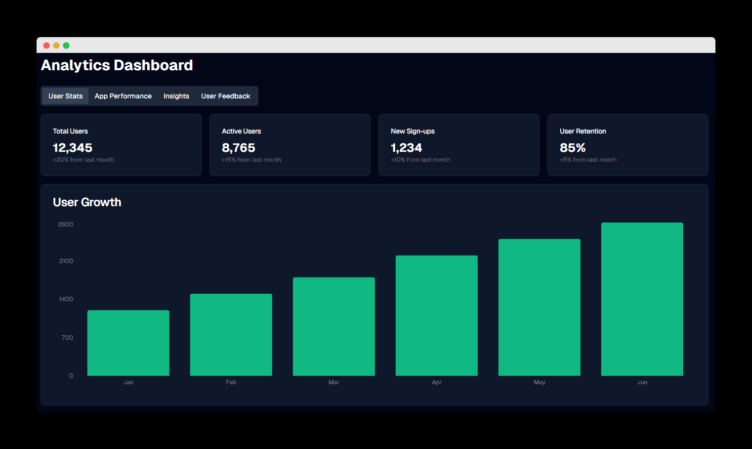

User Stats Dashboard
Overview of key user metrics and growth statistics.
Project Overview
Modular Dashboard Sections
Interactive Data Visualizations
Custom Dark Theme
Responsive Layout
Tabbed Navigation
Technologies
Project Type
Capability Demo / SaaS Analytics Dashboard
Real-Time Analytics for Growing SaaS
Userlytics is a demo we built to showcase our capabilities in custom dashboard development. It demonstrates comprehensive insights into user behavior, app performance, and business metrics. Unlike no-code analytics solutions, a custom platform like this offers complete customization and scalability to meet the unique needs of growing SaaS businesses.
The design combines real-time monitoring capabilities with advanced user segmentation and retention analytics, enabling product teams to make data-driven decisions. Built with performance patterns in mind, it demonstrates handling millions of data points while maintaining sub-second response times. Every feature shown here is production-ready and can be adapted for your platform.
Key Features
Real-Time Analytics Capabilities
- Live user activity monitoring with sub-second latency
- Real-time conversion funnel analysis
- Instant alerts for anomaly detection
- Live dashboard updates without page refresh
Advanced User Segmentation
- Behavioral cohort analysis for user groups
- Custom segment creation based on any user attribute
- Automated user journey mapping
- Predictive churn analysis with ML models
Retention Analytics Features
- Cohort retention analysis with customizable timeframes
- Feature adoption tracking and stickiness metrics
- User lifecycle stage analysis
- Engagement scoring and health metrics
Scalability for Growing SaaS
- Handles millions of events per day without performance degradation
- Horizontal scaling architecture for growing user bases
- Optimized data storage with time-series databases
- API-first design for easy integration
How We Built It
We started with a public layout as a base and expanded it into a fully customized, responsive dashboard with tabbed navigation, interactive chart components, and a data-driven layout -- a strong example of modern React applications in action. This demo presents growth trends, system performance, and feature usage in a way that would be directly useful for startup teams or product managers in a production environment.
We implemented all the data visualizations using Recharts, created the custom dark theme, and designed the modular dashboard components to ensure a cohesive user experience across all sections. All of these capabilities can be customized and deployed for your SaaS product.
Project Goals
- Demonstrate an intuitive analytics dashboard for SaaS product teams
- Showcase data visualization capabilities with interactive charts
- Demonstrate modular dashboard architecture and component reusability
- Showcase a professional dark theme optimized for extended use
Advanced Data Visualization Techniques
This demo employs cutting-edge data visualization techniques to transform complex datasets into actionable insights. It features custom visualization components designed to adapt to specific data patterns -- all production-ready for your platform.
Time-Series Analysis
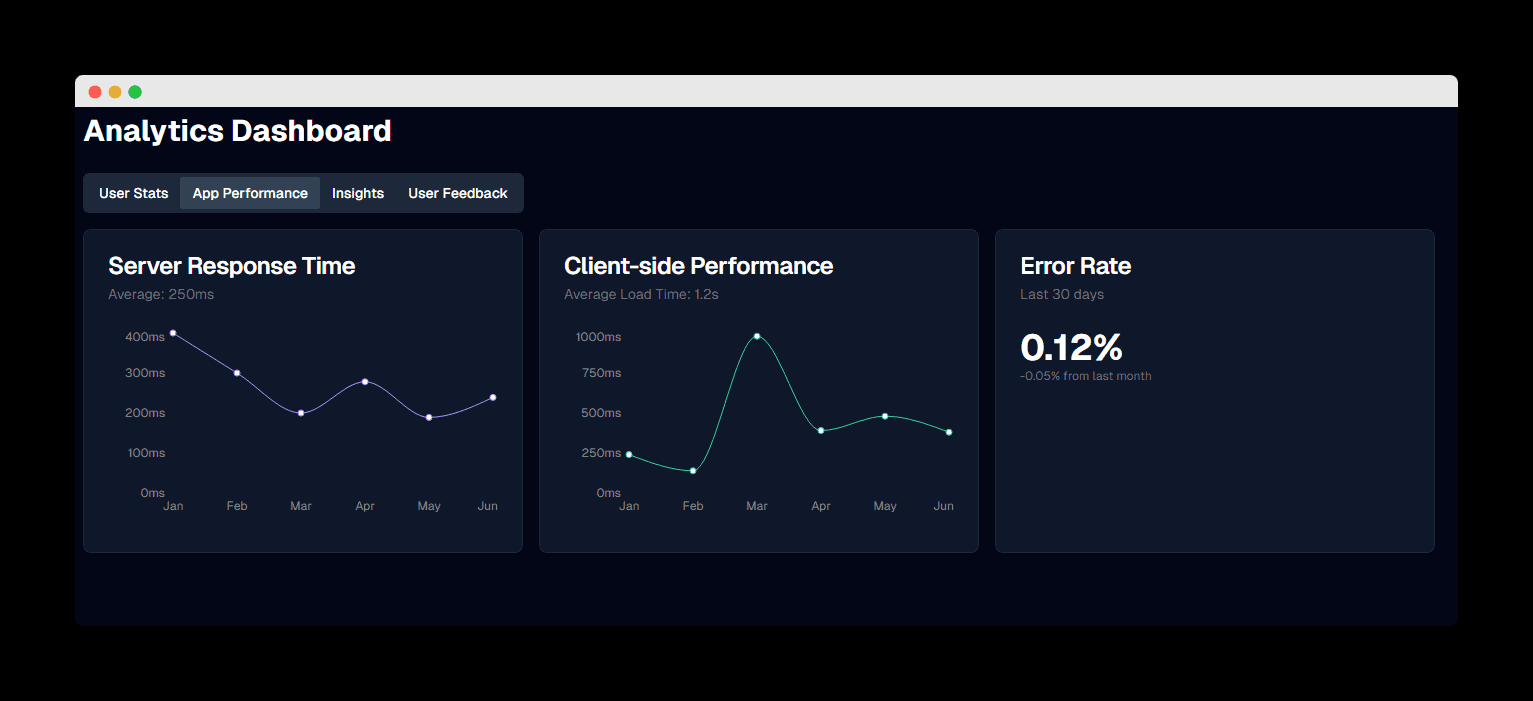
Interactive line charts with zoom, pan, and drill-down capabilities for analyzing trends over any time period. Supports multiple metrics overlay with customizable aggregation intervals.
Cohort Heatmaps
Visual retention analysis using color-coded heatmaps that instantly reveal user behavior patterns and identify critical drop-off points in the user journey.
Funnel Visualization
Dynamic funnel charts that update in real-time, showing conversion rates at each stage with segment comparison capabilities for A/B testing insights.
Seamless Integration Capabilities
API-First Architecture
Built with a comprehensive REST API and webhook system, this demo showcases how a custom platform integrates seamlessly with existing tech stacks. Stream data from any source and export insights to preferred tools.
Supported Integrations:
- Direct database connections (PostgreSQL, MySQL, MongoDB)
- Cloud data warehouses (Snowflake, BigQuery, Redshift)
- Marketing platforms (HubSpot, Salesforce, Mailchimp)
- Payment processors (Stripe, PayPal, Square)
- Custom webhooks and event streams
Real-Time Data Pipeline
The event-driven architecture demonstrated here is designed to process millions of events per second, ensuring dashboards always display the most current data. Built-in data validation and transformation ensure accuracy.
Key Features:
- Sub-second data ingestion and processing
- Automatic data type detection and schema evolution
- Built-in ETL pipeline with custom transformations
- Data quality monitoring and alerting
- GDPR-compliant data handling and storage
Custom vs. No-Code Analytics Solutions
While no-code analytics tools offer quick setup, they often fall short for growing SaaS businesses. Here's how a custom analytics platform like this demo compares:
| Feature | Custom Analytics Platform | No-Code Solutions |
|---|---|---|
| Customization | Unlimited - tailored to your exact needs | Limited to pre-built templates |
| Scalability | Handles millions of events per second | Often struggles with high volume |
| Data Ownership | Complete control over your data | Data stored on third-party servers |
| Cost at Scale | Fixed infrastructure costs | Per-user pricing becomes expensive |
| Complex Analytics | Advanced ML models and custom algorithms | Basic aggregations only |
| Integration Depth | Deep, bi-directional integrations | Surface-level connections |
Bottom Line: For SaaS businesses serious about growth, a custom analytics platform provides the flexibility, performance, and insights needed to stay competitive.
Technical Implementation
Data Visualization
This demo uses Recharts to create responsive, interactive charts that visualize complex data in an intuitive way. The charts are configured to match the dark theme with carefully selected colors for optimal readability and visual appeal.
Responsive Design
The dashboard is built with a mobile-first approach using TailwindCSS, ensuring that all components adapt seamlessly to different screen sizes. The layout adjusts dynamically to maintain usability across devices.
Component Architecture
The demo features a modular component architecture with reusable dashboard elements like KPI cards, data tables, and chart containers. This approach ensures consistency across the interface and simplifies maintenance and future enhancements.
Performance Optimization
To ensure fast loading times and smooth interactions, the demo implements code splitting, lazy loading for charts, and optimized component rendering. This results in a responsive dashboard experience even when displaying large datasets.
Dashboard Modules
User Statistics Module
The User Stats tab displays key metrics including total users, active users, new sign-ups, and user retention rates. The bar chart visualizes user growth over time, showing consistent month-over-month increases.
KPI cards at the top provide at-a-glance metrics with percentage changes to highlight trends. The module is designed to give product managers immediate insight into user acquisition and retention performance.
Related Analytics & Dashboard Services
Fintech Dashboard
Real-time financial analytics and monitoring dashboard for modern fintech applications.
Restaurant POS Analytics
Business intelligence dashboard for restaurant operations and performance tracking.
PropVault Dashboard
Property management analytics platform with comprehensive reporting features.
Want Something Like This for Your SaaS?
Every feature in this demo is production-ready and can be customized for your business. From real-time monitoring to advanced user segmentation, we can build the analytics platform your team needs.